
Mastering the art of selecting artwork for your home: A complete guide
So, if you're someone who truly appreciates art, chances are you've got an eye for aesthetics too. You know how a piece of art can either make or break the look and feel of a room.
However, most of us aren't interior designers. So, how on earth do we pick out artwork that actually works seamlessly with our living spaces? Or decide where to hang the pieces we already own? And what if your taste in art doesn't exactly match the style of your home?
Matchmaking for your walls
When you're livening up your living space with art, think of it like this: it's not about everything being perfectly, matchy-matchy identical. In fact, it's often better when it's not.
What you're aiming for is a kind of artful compatibility. Some parts of your artwork should seamlessly fit into your home's aesthetic, like they were meant to be there all along. But there should also be elements that stand out, creating that interesting contrast that keeps your space from feeling too predictable.
Art, you see, is the secret ingredient that makes a room uniquely yours. It sparks conversations, adds character, but it shouldn't feel like it's landed from another planet.
So, whether you're into bold abstracts, dainty patterned pieces, gritty documentary photos, or any kind of art that tickles your fancy, this guide is here to help you figure out how to identify the visual elements of your home so that you can match it with a piece of artwork you adore, no matter its style.
Interpreting your interior using the visual language of art
Our formula for finding that ideal blend between interiors and artwork is really quite simple, but first requires a perspective shift. Instead of looking at a room as a piece of architecture or interior design we examine it through artwork goggles as if it were a piece of art itself.
Imagine if your interior were a work of art. How would you describe it? This change in perspective makes it a whole lot easier to spot the features in your home that match up with corresponding elements in a piece of art.
Our approach, which we’ll go through in-depth in this guide, also helps you in figuring out the balance between elements that blend seamlessly with your interior and those that pop out and grab your attention.
In other words, we help you decide how much of your art should fit like a glove with your interior, and how much should stand out and make a statement.
In this guide:
1: Firstly, we’ll unravel the mysteries of art and interiors through 5 essential ‘sorting filters’.
2: Next, we’ll dive into real interiors, and categorize them using our 5 artistic ‘sorting filters’, while also touching upon, and introducing you to the 3 different interior types.
3: Applying what you've learned, we'll then dissect an interior, exploring a wide variety of artworks; some that match seamlessly, and others that miss the mark.
4: Advanced techniques! We’ll then explore the other 2 interior types and fine-tune your art selection skills within each, creating visual magic in any space.
Our sorting hat: the 5 sorting filters
Below is our list of elements we use to categorize Interiors & Art (don’t worry, I’ll explain what they all mean in a sec):
Content, Style, & Medium : City vs Country
Density: Strong & Solid vs Delicate & Airy
Value: Light vs Dark
Palette: Colour Scheme + Crisp vs Muted + Warm vs Cool
Matchyness: Cohesive vs Eclectic
Content, Style, & Medium : City vs Country
Alright, let's talk about the big one – our first sorting trick.
This sorting filter roughly covers the ‘what’ of both interiors and artworks. What style is it? What materials are used? What shapes and objects can we see?
And when it comes to answering these ‘what’ questions, we split (and simplify) everything into two camps: City and Country. Think of them as the yin and yang of interiors and art.
We classify using these descriptors for two reasons. Firstly, it allows us to discuss both topics (interiors and artwork) in the same way, which in turn allows us to more easily find corresponding features between the two. It works using these 2 City/Country classifiers because both interior/architectural & art movements and styles are typically recognized due to their level of modernity, and industrialism of the design, or lack thereof. City corresponds to aspects of modernity, and abstraction, and Country corresponds to aspects of naivety or traditionalism, and more handcrafted and representational types of work.
Secondly, it allows us to simplify a virtually unlimited number of styles, techniques, shapes, and materials into just 2 broad categories. This enables you to be able to rapidly grasp the qualities in an artwork you should be looking for in order to make a good match with your interior.
Here’s a list of City & Country attributes you may find within your interior or artwork:
City
Straight lines, smooth surfaces, & geometry
Machine & factory production
Man made & processed materials
Patterns & forms reminiscent of math & computer processing
Modern manufacturing
Country
Curved lines, textured surfaces, freeform structures
Manual construction
Natural & organic materials
Patterns reminiscent of nature or handicrafts
Craftsmanship
Looking at the list provided, City & Country attributes can manifest in various ways. Frequently, interiors and artworks feature a combination of both styles.
The crucial point is to observe how your interior expresses these characteristics and then seek artwork that mirrors this expression.
For example, if your interior features a blend of curved, rounded furniture (country), along with plastic and glossy surfaces (city), and crisp geometric textile patterns throughout (city), you would seek artwork that echoes these elements—curved lines, glossy surfaces, and geometric patterning.
While it might be challenging to find artwork that precisely matches all these attributes in the exact same way, the key is to have enough similarities. This ensures visual distinctiveness and interest, making the artwork stand out while remaining consistent with the overall look and feel.
Density: Strong & Solid vs Delicate & Airy
Now, let's dive into the next sorting trick – it's all about the 'density' of things.
When we talk density, we're asking if your space is all about big, chunky, heavy looking shapes cozied up together, or if it's more like a wide-open, airy dance with delicate structures.
And when it comes to art, are we looking at a composition with large, close-knit shapes, or is it more about having room for tiny, intricate details to shine?
Value: Light vs Dark
Now, this next sorting trick is pretty straightforward. We're talking about the light-dark spectrum of your space & proposed artwork. Is it all about the brightness? Or maybe it leans towards the shadows? Or perhaps it's somewhere comfortably in between?
Natural light can also play a role. You might have a place that's generally light and airy, but if there's not much sunlight peeking in, it might look darker or just find itself somewhere in the middle of the light-dark spectrum.
Palette: Colour Scheme + Crisp vs Muted + Warm vs Cool
This sorting filter comes in three parts, as is all about dissecting the colours in your space.
Color Scheme: First off, we're looking at what colors are hanging out in your interior and potential artwork. And not just what's there, but how much of each color is going on. What shades are in the mix, and are some more dominant than others?

The colour palette in this interior is a mix of white and light tan, with small pops of rusty red, and forest green.
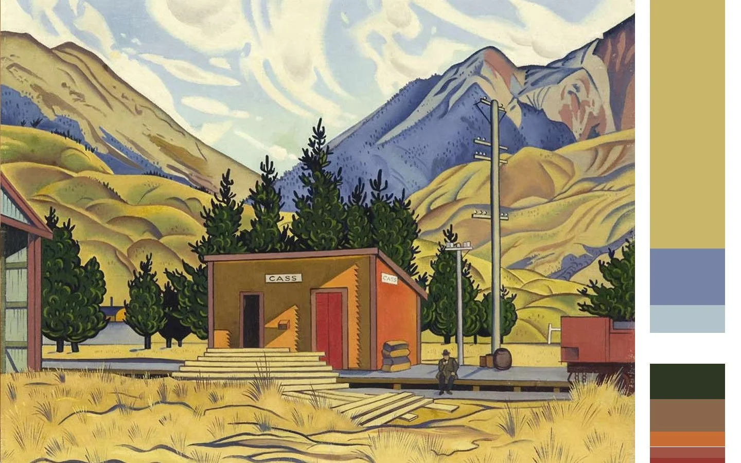
The colour palette in this artwork contains a dominant colour of bright dirty yellow-green, with a range of supporting colours found in nature such as blues, orange, red, brown, and green, albeit in a hyper-saturated variety.
Crisp vs Muted: Do the colours appear bright, sharp, and ‘pure’? Or do they appear to be either more faded looking, or have some brown or gray dusky quality to them?

Crisp
Here’s a palette of crisp colours. While there are many brights, there are also lighter pastel tones, and darker tones too. What they have in common is a clear sharp quality to them.

Muted
And here’s the same palette in the muted variety. Can you see how they look more faded and grayed compared to their crisp counterparts?
Warm vs. Cool: Let's talk about temperature, but not the weather kind. Just like a sunny day bathes everything in a warm golden hue, or an overcast one gives that cooler, bluish tinge, the colors in both your home & in pieces of artwork can do something similar.
Can you guess which direction your colors lean? Are they giving you that warm, cozy, sunny-day feeling, or is there a cool, breezy, overcast-day vibe going on?
Think of it as the climate your colors create in your space. Is it a day at the beach or a stroll in the mountains, color-wise?

Warm
Here is a palette of warm, sun-drenched colours.

Cool
And here’s the equivalent cool palette, in overcast cloudy-day tones.
Matchyness: Cohesive vs Eclectic
Now, let's talk about the fifth sorting filter, which is a bit different from the others. While the other four filters help you decide if specific elements in an artwork harmonize with your interior, this one guides you on what specific aspects in your interior you should be matching your artwork up to.
Cohesive Interiors: In a cohesive interior, there's a strong sense of similarity among different elements within it. It's like all the pieces of the puzzle fit together seamlessly.
So, when you're matching artwork to a cohesive interior, you're not just looking at individual elements. Instead, you're analyzing the interior as a whole and then trying to find artwork that aligns with the overall vibe of the space.
Now, here's the interesting part. If all aspects of the artwork match the interior perfectly, it won't look out of place, but it might not add much character either. It's like the artwork blends in a little too well.
To inject some visual interest and personality, it's often best to have one aspect of the artwork that contrasts a bit with the interior. It's like adding a dash of spice to an already delicious dish. Alternatively, a partial match or two between the artwork and interior on any of the other four elements can also achieve this balance. It's all about achieving that perfect harmony without becoming too predictable.
Now, when it comes to eclectic interiors, things get interesting. Eclectic interiors are all about mixing different types of elements within one space, creating a dynamic and diverse atmosphere.
But there are two flavors of eclectic interiors:
Cohesive Eclectic: In this type, you'll find a variety of elements, but there's a method to the madness. There's a surprising or unconventional mix going on, but you'll notice a common thread running through most of the elements. It's like a beautifully orchestrated chaos.
Here's the trick: Identify the aspect that makes the interior eclectic and do the opposite in the artwork. For all the other aspects, aim for a match.
Incohesive Eclectic: Now, in this flavor, things are even more diverse, and there's not much tying everything together. It's like a vibrant marketplace of styles and elements.
But here's the good news: Your options for matching artwork are wider. As long as you make the artwork match one semi-major element within the interior, you're on the right track. It's like finding that one special ingredient that ties the whole recipe together in a delightful way. So, in these eclectic spaces, you've got a bit more artistic freedom to play around!
Categorizing interiors using the 5 sorting filters.
Now that you've had a look at how we breakdown interiors so we can match it with artwork, it's time to see it in action!
Let's start things off on easy mode. Below, you'll find four interiors that are super cohesive. They have the same value and color palette, making it simpler to grasp the other two sorting filters: Content, Style, & Medium, and Density.
I'll break down each interior and then pair one of them up with some artwork in a wide range of styles.


Interior 1:
Content, Style, & Medium:
1: Crisp Geometric Room (City): This interior is defined by its crisp, geometric structure with minimal details to soften or break up the lines. It's visually one large, uninterrupted plane of a single color, embodying extreme simplicity.
2: Curved Lines and Organic Shapes (Country): Here, you'll find a play of curved lines and soft, blob-like shapes with gentle edges, giving it a more natural, countryside feel.
3: Natural Textures and Accents (Country): This space embraces natural fabric textures and accents crafted from raw materials, evoking a rustic, countryside ambiance.
Density: The interior leans towards being mostly light and spacious. There's a mid-weight quality to certain elements, almost fluffy and floating. The structural aspects hold a solid and substantial presence.
Value: It's predominantly light, featuring a broad canvas of white-on-white with occasional touches of muted yet warm wood and natural tones.
Cohesiveness: Cohesion is high in this interior, with design elements harmonizing seamlessly,

Interior 2:
Content, Style, & Medium:
3: Modern Industrial Shine (City): This interior flaunts man-made industrial materials like glass and stainless steel, exuding a city vibe.
2: Sleek and Shiny Lines (City): It's all about straight lines and smooth, shiny surfaces, capturing that urban aesthetic.
1: Angular Geometry in a Grid (City): You'll find touches of angular geometric forms scattered amidst a grid-like layout and structure.
Density: The wall paneling leans towards light to medium weight, while the furniture tends to be more medium weight with blocky designs.
Value: This interior is predominantly light, featuring mostly white with subtle silver accents.
Cohesiveness: The cohesion here is high, with all elements within the interior matching the same vibe. .

Interior 3:
Content, Style, & Medium:
1: Crafted Country Charm (Country): This interior boasts decorative ornate trimmings and furniture craftsmanship that embodies the charm of the countryside.
2: Wooden Warmth (Country): It's mostly wood and wooden textures, although slightly modernized in a white hue, yet still maintaining that cozy countryside feel.
3: Square Shapes (City): The regular square-shaped construction of furniture, structures, and cabinetry frequent this interior.
Density: The structural pieces and details fall in the medium density range, with light to medium-weight open spaces in between.
Value: This interior is predominantly light, featuring an all-white palette.
Cohesiveness: Cohesion is high here, with design elements coming together seamlessly, creating a sense of harmony throughout the space.

Interior 4:
Content, Style, & Medium:
1: Dominant Chunky Geometry (City): This space is ruled by chunky rectangular blocks tightly packed, forming a 3D grid.
2: Sleek and Shiny Surfaces (City): Smooth and shiny surfaces abound, giving that futuristic modern feel.
3: Textured Grid Detailing (City): A grid structure weaves through textures, from square floor tiles to rectangular kitchen tiles, even showing up in grid-patterned cushion covers. Small metal accents reinforce this grid.
Density: Prepare for a dense experience here; everything is very chunky and tightly packed.
Value: The color palette is predominantly light, featuring mostly white with metal trims. There are subtle accents in navy-gray and gold-gray textiles, lending a muted, cool tone.
Cohesiveness: Cohesion is at its peak here, with design elements creating a strong sense of unity within the space.
Let's Review: pin-pointing artwork traits for the perfect interior match
We'll now focus on Interior 1 for detailed artwork matching. But before we dive in, let's review this interior and outline the specific qualities we need in an artwork match.
Content, Style, & Medium:
1: Crisp Geometric Room (City): This interior is defined by its crisp, geometric structure with minimal details to soften or break up the lines. It's visually one large, uninterrupted plane of a single color, embodying extreme simplicity. Everything is arranged centered with a central focal point. There are subtle city details to add visual interest such as the thin diagonal lines on the floor, and the thin straight structures on the lamp. All the shapes look mostly flat, matte, and 2d giving a slight graphic quality.
2: Curved Lines and Organic Shapes (Country): Here, you'll find a play of curved lines and soft, blob-like shapes with gentle edges, giving it a more natural, countryside feel.
3: Natural Textures and Accents (Country): This space embraces natural fabric textures and accents crafted from raw materials, evoking a rustic, countryside ambiance.
An artwork match will have:
simplicity
soft floaty geometry
flat, matte graphic treatment
curved blob shapes
subtle thin lines
natural subtle textures
central orientation
soft or faded out edges
*A match will have a majority of these elements, but doesn’t need to have all to be a match.
Density:
The interior leans towards being mostly light and spacious. There's a mid-weight quality to certain elements, almost fluffy and floating. The structural aspects hold a solid and substantial presence.
An artwork match will have:
light-mid density
airy flow between elements in artwork
light-mid application of materials
Value:
It's predominantly light, featuring a broad canvas of white-on-white with occasional touches of muted yet warm wood and natural tones.
An artwork match will be:
light
Palette:
It's predominantly light, featuring a broad canvas of white-on-white with occasional touches of muted yet warm wood and natural tones.
An artwork match will be:
Muted & Warm
Or Exact matches of white, and the variety of warm browns, and light green present.
Cohesiveness:
Cohesion is high in this interior, with design elements harmonizing seamlessly,
Now for some artwork matching
Alright, let's dive into Interior 1 and explore some artwork styles. I've handpicked a bunch of different types of artwork, organized in pairs for a closer look. In each pair, one artwork will be a perfect match for the interior, while the other one won't quite hit the mark. This way, you'll discover two things.
First, you'll realize that finding artwork that suits your interior can span a wide range of styles. And second, you'll sharpen your eye to spot those specific elements within an artwork that make it either a fantastic match or a bit of a miss.
Simple monochromatic organic abstracts
Now, as we begin our art-interior matching journey, let's start with some artwork that's relatively simple in terms of its elements. It'll help us ease into the process.
These three artworks all have quite a few elements that align with the interior. However, keep in mind that in the delicate art of matching, too much or too little of one of the four key elements can throw off the balance and make it not quite a perfect match. Let’s take a closer look…

Piet Mondrian: Composition 10 in Black and White (L,), Piet Mondrian: TABLEAU No. 2 Composition No. VII (C), Franz Kline: Mahoning (R).
Too matchy matchy
1: Content Style, & Medium: This artwork is simple, curved, blobby, centrally positioned, flat 2d treatment, action fades out toward the edges/corners, has an organic textural quality with the painted brushstroke background, and has thin black line details. Match.
2: Density: The artwork is spacious, minimal, and has lots of space around each of the small black lines. Match.
3: Value: Light. Match.
4: Palette: Whites. Match.
Overall: It’s too matching
Even though every aspect of this artwork aligns with the interior, it tends to blend into the background. Adding a few small elements that don't precisely match could enhance its presence in the room.

It’s a boring match…
1: Content Style, & Medium: This artwork is fairly similar to the last. It’s simple in terms of the colouring and repetition of the small sub-segmentations , it’s centrally positioned, and painted texture takes on a circle like appearance with the faded out corners, there’s somewhat of a flat 2d treatment yet each sub-segment has a slight 3d quality with the rough gradient paint treatment which gives off a textural foliage quality. There’s also relatively thin black lines, but this time they’re more freehand than perfectly straight, and vary in thickness in places.. Match.
2: Density: The artwork is minimal, a little more tightly spaced than the last one, although the last one was very light and this one is just regular light. Match.
3: Value: Light - Light +. Match.
4: Palette: Different variants of Whites, muted warm browns and yellows, and in places an exact match to the khaki green ornament can be found. Match.
Overall: It’s a match
While this might be seen as a great match by some, I personally find it somewhat lacking in personality. Although I adore this artwork, it seems like the anticipated choice for this interior, closely mirroring the existing interior without introducing much new, aside from some added texture.

Too dense & square
1: Content Style, & Medium: This artwork is simple in its use of line only, yet those lines are straight, thick, going in all directions, and overlapping. Your eyes are lead in all directions, and there’s no central focal point in the piece. Not a Match.
2: Density: The artwork has a bit of clear breathing space around the elements, yet the linework is so chunky and thickly applied. The density is on the mid- higher end of things, and overpowers the rest of the room. Not a Match.
3: Value: Light-Mid. Match.
4: Palette: Mostly white which is a match, yet black isn’t really featured around the rest of the interior except for tiny accent details. Not a Match..
Overall: It’s not a match
The substantial and dense nature of this artwork results in it overpowering the room's attention. A more fitting match would allow the artwork and the other elements in the room to share attention equally.
Bright Geometric Abstracts
Now, considering the interplay within this interior, where you have the city-style geometry mingling with the softer, more natural country forms and textures, I've handpicked these two geometric abstract pieces. They illustrate how you can explore a predominantly City genre of artwork and still find pieces within that genre that carry subtle Country aspects.

Wassily Kandinsky: Swinging (L), Wassily Kandinsky: Composition VIII (R)

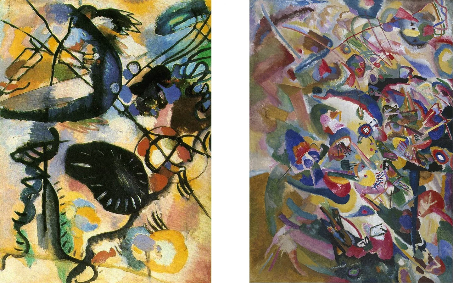
Too cramped, busy, angular, and dark
1: Content Style, & Medium: There’s a lot of geometric overlapping elements. We have a variety of sizes of squares, triangles, lines, and circles. There’s some curve with the circles, but overall this artwork is more grid-like than rounded. There’s a lot going on, and it’s not very simple. It’s however mostly flat and graphic. There’s also a hint of organic texture with the bumpy paint treatment almost exposing the underneath paper texture. There’s a couple of small elements that match, yet overall… Not a Match.
2: Density: The artwork is packed in tight with all the different elements. Everything seems heavily weighted down to the bottom L corner with very little floaty elements. I'’s overall a fairly middly-dense peice. Not a Match.
3: Value: Mid-Dark. Not a Match.
4: Palette: We have a variety of muted, cool off-primary brights, with a dash or 3 of black. Not a Match..
Overall: it’s not a match
When viewed independently, the artwork appears dynamic and exciting. However, within this interior, it seems chaotic and discordant. Set against the backdrop of the soft, minimalist surroundings, this busy and angular artwork appears out of place and doesn't harmonize well.

Light, fresh, and playful
1: Content Style, & Medium: This artwork boasts a disorganized simplicity, featuring numerous small geometric shapes—some tiny squares, but predominantly lines and circles. It maintains a flat and graphic quality, with action going on all throughout the canvas, yet most of this action concentrates in the center of the piece. While there's not an abundance, there are subtle touches of paper and paint texture that soften the edges of some geometric shapes. However, the most striking detail is the multitude of thin lines extending in all directions. At first glance, this detail may not seem like a match, but take a closer look, and you might start noticing the numerous other thin lines in the interior, like those in the tiles and table legs. It’s a Match.
2: Density: The artwork is spacious, minimal, and has lots of space around each of the elements in the artwork — especially the thin black lines. It’s very light overall. Match.
3: Value: Light. Match.
4: Palette: Whites, with muted warm & cool soft primary shades (but more warm than cool tones). Match..
Overall: It’s a match
I love this! The artwork injects a childlike playfulness into a room that might otherwise come across as somewhat serious, as it’s very minimalist, meticulously pruned, and organized. Additionally, the thin black lines in the artwork draw attention to the similarly slim black lines between the flooring tiles. Because what’s accentuated in the artwork is also what’s brought to prominence in the interior.
Curvy Organic Bright Abstracts
Abstract with a touch of organic curves might seem like a perfect match for our interior, right?
Well, it's a good starting point, but it's not the whole picture. I've chosen these two curvy, organic abstract pieces to show that while you might be in the right ballpark, the details matter. Paying attention to the specifics within each artwork is key to making sure it truly fits seamlessly.
Wassily Kandinsky: Macchia Nera (L), Wassily Kandinsky: Draft 3 for Composition VII (R)

Dark spots devouring your attention
1: Content Style, & Medium: This artwork exhibits some similarities with the interior, such as the round, blobby shapes, a flat graphic treatment, and a subtle use of texture in the paint. However, where it diverges lies in the absence of simplicity, as this piece lacks a sense of refined orderliness. Additionally, there's a disparity in the central focus, as elements in this artwork are distributed across the corners, sides, and the middle. 50/50.
2: Density: The density in the artwork is moderate. There's space between most elements, though not substantial, with areas of increased compactness. Additionally, you'll notice instances of heavily applied material interspersed with more lightly applied paint.. Not quite a match, but not too far off.
3: Value: Mid overall with a few deep dark patches. Not a Match.
4: Palette: Light cool pastel tones of yellow and blue with large pieces of black dominating. Not a Match..
Overall: not a match
With the dominant presence of the black ‘jellyfish’ like forms, which demand your attention, this artwork struggles to integrate well into this interior.
These forms not only exhibit an excessive darkness but also, despite their curved nature, display messy jagged edges—a stark contrast to the smooth curves of the interior. The somewhat similar nature of the forms doesn't enhance the fit of the piece in the room; rather, it draws attention to these shapes, prompting you to notice and compare the dissimilarities between them.

Contemporary foliage: A warm welcome
1: Content Style, & Medium: This artwork is complexly simple. It reads as one large texture, made up of smaller different textured pieces. The “pieces” are un-uniformly rounded like mis-shapen jigsaw pieces. The treatment is rather flat and graphic 2d, and the paint, and overall pattern leaves a textured organic foliage feel. Match, only just.
2: Density: The is low-mid, there’s something rather dainty about the shapes even though they’re quite close together. There’s also a lot of white running through the piece giving it breathing room. Match.
3: Value: Mid. Not a Match, but not too far out of range.
4: Palette: A mix of mostly warm muted earthy greens, with a dash of muted warm pastel pink, cool crisp blue & pink, with shades of white to break it all up. Mostly a Match..
Overall: It’s a match
This artwork introduces a warm and homely atmosphere to the room, transforming it from a somewhat impersonal environment to one that feels lived-in, all while maintaining its modern aesthetic.
Simple Graphic Posters
Not exactly a fine art connoisseur, but still want to spruce up your walls with some visual flair?
Well, I've got you covered with these two straightforward graphic movie posters. They're here to demonstrate how you can broaden your horizons and look beyond traditional "art" to find visual pieces that sync perfectly with your interior.

Saul Bass: Exodus (L), Saul Bass: Such Good Friends (R)

Angular, square, and dominating
1: Content Style, & Medium: This artwork is simple, flat, and graphic, with the main action center positioned. The main graphic and text however has blunt edges, is boxy in shape, and the eye is lead off the page with the strong diagonal. Not a Match.
2: Density: The artwork is minimal, and has lots of space around the main graphic. Match.
3: Value: Lower Mid. Match-ish.
4: Palette: White, black, warm crisp paleish blue. Not a match..
Overall: Not a match
Apart from the obvious issue of featuring a gun (which was perhaps predictable in its unsuitability for the calm serene room), my attention seems trapped along the gun shaft, particularly where it intersects with the hand holding it.

Sleek rounded graphic with delicate lines
1: Content Style, & Medium: Once again, this artwork is simple, flat, and graphic, with the main action center positioned. The main graphic and text however have different qualities to the last example. The main graphic is curved and blobby, with thin delicate line work in both the text and the graphic. Match.
2: Density: The artwork is minimal, and has lots of space around the main graphic. Match.
3: Value: Mid Plus. Not a Match.
4: Palette: Muted warm bold red, black, small dash of white. Match..
Overall: It’s a match
This artwork or poster injects a contemporary, pop-cultural vibe into the room, prompting me to now envision the space as an apartment in a bustling city. In contrast, the interior on its own, without the artwork, exudes more of a secluded sanctuary feel.
Traditional Representational Figurative Painting
We’ve taken a deep dive into abstract forms, shapes, and linework. Now let’s shift our focus to some more recognizable forms of art. Let’s take a look at a couple of traditional portraits, and see how they work in our modern interior.

Angelica Kauffmann: Flora (L), Angelica Kauffmann: Lady Georgiana Spencer, Henrietta Spencer and George Viscount Althorp (R)

Angular flow in mismatched tones
1: Content Style, & Medium:
This artwork, featuring a single-person portrait, carries a certain simplicity. For a representational portrait, it tends to be relatively flat and graphic, lacking strong light/dark contrast in its three-dimensional portrayal of the woman. The use of paint introduces a natural texture to the piece. The woman’s body also emphasizes her curves around the shoulders and arms. However, from a compositional perspective, strong diagonal lines formed by her arms and a sloping back create a criss-cross shape. The artwork extends to the edges, guiding the viewer's gaze outward and avoiding a central orientation. This asymmetry disrupts the overall central symmetry of the room. Not a Match.
2: Density:
The material application in this artwork feels somewhat light, creating a breezy flow as your eye moves around the piece. However, the tight cropping contributes to a mid-density range. Match, but only just.
3: Value: With white and pastel tones making up the majority of this artwork, it’s a light-mid artwork. Match.
4: Palette: The artwork features white in the dress and touches of brown in the hair, mirroring elements found in the interior. However, the cool tones in the artwork don't align with the warm color scheme of the interior. Not a Match.
Overall: Not a match
My attention is consistently drawn from the top of the woman's head, down her back to the fanned grass in the interior, then back up through her arms to her head, creating a continuous loop. This visual path confines my focus and doesn't encourage exploration throughout the rest of the room.

Cozy countryside fairytale
1: Content Style, & Medium: This artwork has a few figures simply seated, wearing off white with curved forms in the drapery of the dresses and the curve of the shoulders. It’s not 2d flat; you don’t often get that with representational figurative works, but the light/shade contrast is rather flat. There’s not bright highlights, or deep darks. Match.
2: Density: The artwork is somewhat closely cropped around the figures, giving a tighter density, yet the eye flow around the figures is somewhat light owing to having a bit of clear space around the edges of the canvas frame. Not a Match, but only just.
3: Value: Mid Plus. Not a Match.
4: Palette: Warm whites, with muted warm reds, and greens. Match.
Overall: It’s a match
This artwork, portraying an idealized country life from a bygone era, imparts a warm and rustic ambiance to the room. It harmonizes seamlessly with the deep, dark wooden tones prevalent throughout the space, guiding my eye along them.
An intriguing detail worth noting is the well-coordinated sun direction in the artwork, aligning precisely with the natural light entering through the left window.
The framing factor: altering art's overall compatibility with your interior.
Now, let’s talk about framing. It has the power to really change how a piece of art fits within your home.
Sometimes your favourite piece or type of art doesn't quite align with your interior. And in some cases, the way you frame a piece of art can help bridge this gap.
Evaluating the frame, the mat board (the flat card border area surrounding your artwork), and the artwork itself together, how does the artwork in its entirety now fit within your interior?
I've chosen this artwork below to demonstrate the framing effect because, firstly, it's close but not an exact match. Secondly, it's a Neo-classical war painting. If this happens to be your preferred art style, finding a perfect match for this calm, serene interior could be challenging.

Jacques-Louis David: Napoleon Crossing The Alps

Energetic motion unleashed
1: Content Style, & Medium: The central focus of this artwork is strategically placed at the center, avoiding any spillage beyond the edges. Rounded forms in off-white depict the horse's rump and chest. While the figures boast a pronounced three-dimensional quality, thanks to the adept use of light and shade, the background adopts a more two-dimensional appearance, with a fog-like washout effect. Though not overtly simplistic, this piece exhibits a certain straightforwardness within its genre—neoclassical war painting—featuring solely a man on horseback. Some viewers might discern the dynamism of a horse on its hind legs, capturing the tense anticipation of its descent back to all fours. Match.
2: Density: The artwork features a main horse figure that is semi-floated, surrounded by open space. The density is not particularly light but rather falls in the mid-range. However, the surrounding airflow imparts a lighter, more floated quality to the overall density.. Match.
3: Value: Mid Plus. Not a Match.
4: Palette: Warm off white with warm yellows, browns, green. Match.
Overall: It’s a match
While this artwork aligns artistically with the interior's attributes, the depiction of action and motion, coupled with the war-related associations (a painting of Napoleon Bonaparte heading off to war), might create an unwanted juxtaposition for some viewers with the otherwise serene ambiance of the interior.

Historical documentary elegance
1: Content Style, & Medium: The same artwork, now framed with a large white mat board and a thin black frame, takes on a more graphic and two-dimensional appearance. The grand impact and dynamism of the horse have been subdued through a reduction in scale and the confining effect of the frame. The thin black frame now harmonizes with the other slender straight black lines present in the room. The overall perception of the image has subtly shifted from an epic, dynamic war scene to a grand, historical piece of memorabilia. The act of framing this moment almost transforms it into a documented specimen rather than something to be emotionally felt and experienced in the present. Match.
2: Density: The artwork has now been made more airy and spacious with the large white mat board surrounding the artwork. Match.
3: Value: Light Mid. The addition of extra white has shifted the value of the overall piece in a lighter direction. Match.
4: Palette: Muted warm bold red, black, small dash of white. Match.
Overall: It’s even more of a match
The inclusion of a spacious white border and a thin, refined frame around this historically themed artwork imparts a grand museum-like elegant ambiance to the room.
A Closer Look at Palette…
Now, look at these two artworks – almost identical, but not quite.
The left one? It's muted and warm, a perfect match for the interior. Now, the right one? Muted too, but it's got a cool undertone.

A bit of contrast is a good idea, right? Well, yes, but here's the trick. For it to really work, it has to look intentional, like you planned for it to stand out. But with the cool-toned one, the colors seem a bit off, don't they? Like the artwork has been faded in the sun.
If you are wanting to pull off that contrasting colour, fully commit to it. Don’t have the artwork colours half match when it comes to the 3 attributes of the colour palette: Colour Scheme + Crisp vs Muted + Warm vs Cool
Monochromatic Photography
Alright, time to shift our focus to photography. It follows the same principles, but there's a unique twist to it.
Considering photography is basically capturing bits of our real world, people often see the scenes and objects more than the abstract shapes or patterns within.
Now, you might be thinking, does this city vs country thing even apply to photography? Well, yes, it does, but let me toss in a few extra points specific to photography:
City
Images portraying modernity like construction sites, cities, traffic, speed, etc.
Abstract images highlighting form, line, pattern.
A twist on natural scenes, e.g., black and white, altered colors.
Images visibly set up, involving models, makeup, airbrushing, posing, etc.
Country
Images showcasing the natural world: nature landscapes, still life, farms, animals, natural human interactions.
Representational images aiming to depict the world as it is.
Minimal processing and editing apparent.
Images appear candid, capturing observations of the world.
Abstract Photography
Let's start by exploring abstract photography. In these two plant photos, the focus isn't just on the plants themselves; it's more about capturing the intriguing forms they create. The photographer seems more interested in highlighting the beautiful shapes and symmetry these trees naturally form, rather than just saying visually, "Look, it's a tree!"

Roman Loranc: Floating Oak (L), Ansel Adams: Involute Cactus Organ Pipe Monument (R)
Both of these photographic artworks match within the interior. I've chosen them specifically to show you what line and abstraction in photography is all about. Photography, with its inherent ties to things we immediately recognize, can sometimes obscure our attention away from the shapes, lines, and forms contained within the images. In these two ‘tree’ examples, these visual aspects are rather obvious, providing a solid foundation to delve into these concepts. Let’s explore in more detail below…

Perfectly imperfect symmetry of nature
1: Content Style, & Medium:
Although this is a photograph, it's been captured and edited to resemble more of an ink line drawing than a typical photograph. The image of the tree has been crafted to emphasize its form, symmetry, and shape. The contrast has been heightened, reducing the details that are characteristic of natural scenes and leaving a flat, graphic, and simplified representation. This approach highlights the pronounced semi-circle shape created by the tree trunk and its reflection. Additionally, the thin, almost-black lines of the branches and sub-branches contribute to the overall graphic and stylized effect. Match.
2: Density:
The overall density of this piece falls in the light to mid-range. The background is predominantly light, and despite the very dark branches, there's an airy quality to their shape. This, coupled with the presence of water below, contributes to a sense of lightness and floatiness in the depiction of the tree. Match.
3: Value: Despite the intensified darkness of the tree branches, the overall tone of this piece leans toward the light-mid range, thanks to the clean and bright white background. Match.
4: Palette: Stripped of color in this black and white photograph, it falls into the neutral spectrum—neither warm nor cool, just balanced. The prevalence of white in the image echoes the neutral tones found throughout the interior. Match.
Overall: It’s a match
The wiry nature of the branches introduces an organic and untamed vibe, while the artworks overall simplicity seamlessly blends with the room's orderly aesthetics without disrupting its sense of neatness.
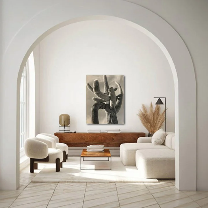
Noticing the spanish-style touch
1: Content Style, & Medium:
In this photograph, the arms of the cactus introduce a profusion of curved lines and blobby forms, along with subtle natural textures accentuating these lines. Despite the 3D quality resulting from the perspective, the overall impression is somewhat graphic. This effect is heightened by the contrast of the relatively dark cactus form against a simple grey background, rendering it a relatively simple work. Match.
2: Density: The density of this piece lingers around the lower mid-range. Although it possesses an airy quality with open spaces, the decision to tightly crop the image on the cactus adds a sense of constraint, nudging the overall density up a notch. Match-ish.
3: Value: This photographic artwork hovers around a mid- light on the light to dark spectrum. Match.
4: Palette: Once again, neutral tones work in well in this space. Match.
Overall: It’s a match
The presence of the cactus, a nod to Mexico, has me viewing this interior through that cultural lens. It evokes images of sun-drenched Spanish-style architecture, complete with marble floors and rounded arches.
Let’s explore shape in more detail
Now, let’s delve into the shapes of these two more representational photographic artworks. Train your eye to see beyond the recognizable landscapes before you, and to focus on the broader shapes that define the composition.

Ansel Adams: Mount Williamson, Sierra Nevada, from Manzanar, CA (L), Ansel Adams, Untitled (R)
These two photographic artworks illustrate an intriguing point. The left photo has immediately apparent round ‘boulder’ shapes, yet actually has squarish blocky shapes when the photo is analyzed compositionally.
Conversely, the right ‘tree’ photo doesn’t appear to have any round shapes, compositionally however — it does.
Seeing shapes in a photograph
I want to show you how to see beyond the familiar images and objects in a photograph to the broader compositional shapes and lines found within.
A good place to start is to squint your eyes until recognisable details disappear into the blur, and what’s left is broad swathes of colour and shape.
I’ve taken the original photographs and blurred them. What shapes can you see?

Here’s what I see
I've marked in red the primary compositional shapes I observe.
On the left, there's a substantial rectangular base with two smaller triangles above (the circular boulder shapes lack sufficient contrast to be discerned).
On the right, a curved line follows the canvas's base, accompanied by a slender diagonal stem hosting two blobby oval shapes on either side.

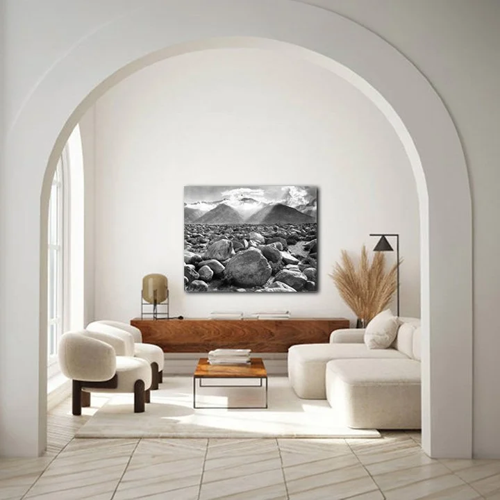
A dark rugged expanse
1: Content Style, & Medium:
This photo captures a wide expansive landscape with depth, which is anything but a flat-graphic style. It's detailed, and the scene extends right to the edges. The aspect I want to highlight here however are the round boulders that dominate the foreground. While there’s curves in the ‘boulder’ detailing, compositionally, this artwork is actually square and blocky — a large rectangle with two smaller triangles. Perhaps the saving grace of this piece when it comes to alignment with the interior is its symmetry. It’s also somewhat simple due to being monochromatic grey and not heavily contrasted, allowing you to focus on the textures. Only just a Match.
2: Density: This artwork is middly-dense, everything is tightly packed, with not much breathing room in the composition. Not a Match.
3: Value: We’re looking at an artwork on the darker middle end of the light/dark spectrum, but doesn’t cross the line into being too dark. Match.
4: Palette: Everything is neutral black and white. Match.
Overall: It’s a match
With this photographic artwork referencing the rugged, untamed outdoors, my attention is naturally drawn to other outdoor elements in the room, like the fanned grass and the natural wood textures.

Bonsai zen
1: Content Style, & Medium:
In the realm of photographic artistry, this piece takes a distinct approach, embracing a flat and graphic style. The backdrop is predominantly one-toned, providing a stark contrast to the strikingly graphic tree that commands the foreground. Shadows are rendered darker and chunkier, resulting in a less intricate but more vivid final image. Despite being a landscape, it boasts a certain simplicity — a solitary tree against a plain canvas, with the focal point neatly centered and ample open space at the periphery. Now, the magic lies in the rounded, blobby shapes that subtly mirror those found within this interior space. Match.
2: Density: The density of this artwork is a light mid. There’s a lot of airy breathing room around the central tree, plus quite a lot of light fine detail. The only thing pushing it toward the mid range is the shadows that have been pushed darker than they otherwise would have been if not altered in editing giving the appearance of more solidity to the objects within this photograph. Match.
3: Value: Light-Mid. Match.
4: Palette: Once again, everything is neutral black and white. Match.
Overall: It’s a match
The photographic artwork, resembling a bonsai tree, transforms the room into a Japanese Zen garden aesthetic.
Cohesive Eclectic Interiors
Picture a Cohesive Eclectic Interior as a bit of an eccentric masterpiece. It's like the hand of a skilled organizer worked some magic. Most of the time, you’ll find a professional interior designer orchestrating things behind the scenes.
In these spaces, expect the unexpected. You'll find a wild combination of elements that, on paper, shouldn't make sense together, yet somehow, they create this intriguing harmony.
Maybe it's a mashup of styles you wouldn't think could coexist, a play of colors and textures that defy the norm but somehow click, or just an overall vibe that should be overwhelming but turns out to be strangely perfect. It's the art of organized chaos, and it's a wonder in itself.
How to make an artwork match in a Cohesive Eclectic interior:
So, in a Cohesive Eclectic interior, despite all the wild contrasts in style, color, shape, or pattern, there's a unifying thread tying everything together. Without it, the chaos would just feel like chaos.
Now, to make your artwork shine in this organized chaos, you've got to play a bit of a game. Identify that sneaky common thread and pick an artwork that's the opposite of it. That way, your artwork stands out, making a statement.
But, here's the trick: you don't want your artwork upsetting the delicate balance. So, try to weave in as many contrasting elements from the interior into the artwork. It could be matching colors or styles found in your eclectic mix of interior elements.
In a nutshell: Go opposite of the uniting element, but match with everything else.

Content, Style, & Medium:
1: Arts and crafts inspired evenly-spaced patterns (Country/city mix): Check out the jacquard oriental prints on the cushions and chair, plus the leafy wallpaper that feels handmade with those little imperfections, giving off serious arts and crafts vibes.
But here's the twist—it's not your grandma's style, nor does it feel outdated, even though it's giving a nod to those older ideas. Thanks to the sleek block coloring and consistent patterns, these crafty vibes got a modern upgrade.
2: Small geometric evenly-spaced patterns (City): Take a look at the red and white thin stripes on the sofa, the textured dotted rug, and the triangle geometric quilt—there's a good dose of geometric patterns going on.
3: Geometric forms atop spindly “stalks” (city): (City): The rectangular furniture like couches and chairs are lifted on 'legs'. Tables, always with 'legs', sport particularly long and thin ones compared to the usual. Even the lamps join the club with semi-large shades perched on thin stems. And hey, some of those wooden stems even flaunt spherical blobby 'beads'.
Density:
It's a mid-light density scene. Despite a few larger scale shapes, the magic of 'stalks' beneath everything gives the illusion that it's all light and floating.
Value:
In terms of value, it's mid-light. Even with plenty of mid-range colors, the room has this sunlit vibe, creating an overall lighter impression.
Palette:
It’s a rainbow mix—bright, cool, crisp off-primary colors mingling with whites, and just a hint of dark teal shaking things up.
Cohesiveness:
It's a wild mix of patterns, colors, patterns, and more patterns that theoretically shouldn't work together. Yet, there's such consistency of small-scale evenly spaced bright patterns everywhere that somehow ties everything into a harmonious whole.
An artwork match will be opposite of the uniting element.
The uniting element is small scale repeating patterns, therefore a match should be:
Flat block colour
No pattern
Semi-simple; not lots of small details
An artwork match will also:
Be bright in colour referencing several colours in the room
Not be overly dense or heavy, a medium at most
Will be modern or have graphic like qualities
Let’s explore some artwork to match
In the previous interior, we checked out a broad spectrum of artwork styles. Now, with this Cohesive Eclectic Interior, our scope for matches is more focused. We're on the prowl for something modern, simple, bright, with flat colors—no patterns, please.
So, let's really get into the details of this range. We'll explore what happens when there's too much pattern, where the line blurs with repeating details that aren't quite patterns, and whether a surplus of block color clashes with the overall patterned vibe in the room.
Patterns that match a bit too much
We're starting with some dead-on matching patterns to illustrate the impact they have in the interior. Remember, our goal here is the opposite—we should be steering clear of patterns.

Owen Jones: Ornament Pattern Design Square from Moresque Plate No. 5 Variant 4 - Circular Moorish Design (L), Owen Jones: Persian No. 1, (segment) (R)

Adds clutter
1:Go opposite of pattern: Check this out—same scale, rhythm, white content, and similar colors. It's almost like an oddly placed patch of different wallpaper. It’s undeniably a pattern. It’s a no.
2: Match to all other elements: Considering most other elements are patterns like this, it naturally matches the rest of the room.. It’s a yes.
Overall: Not a match
As you can probably tell, this artwork just fades into the background — it literally looks almost exactly like the wallpaper, and adds more detail making the room appear cluttered.

Block patterns off scale
1:Go opposite of pattern: This one is obviously a pattern, but unlike the last one, it's also a block color. No more blending into the wallpaper—it stands out. In fact, it's the most noticeable thing in the room. Hmm, a bit confusing, isn't it? It's like it's both a pattern and its opposite. It’s a ??
2: Match to all other elements: You likely observed that this pattern is considerably larger than the other delicate patterns scattered around the room. While variations can enhance visual appeal, when it's almost identical but slightly off, it appears more like an awkward mistake.
Returning to the point that this artwork is the most prominent element in the room, it stands out for a couple of reasons. Primarily, with its predominant dark block color and minimal white or lighter shades, it appears notably dark and dense in contrast to the overall ambiance of the room.
*While we do have reds and blues in the artwork found elsewhere in the room, only reds are directly below the artwork on the couch. Shades of blue, however, are more scattered. This means attention is drawn to the swath of red in the center of the room, when without the artwork, you'd take in each item more equally. It’s a no.
Overall: Not a match
*You might have noticed a shift in my tone as we discuss matches in this interior. In the last one, it was more about, "Well, it's close enough, why not?" Now, it needs to be super precise, balancing colors in specific parts of the room. What's that about?
In a Cohesive Eclectic Interior, there's a skilled, delicate balance to make all the diverse elements appear cohesive. Achieving this balance takes finesse to avoid tipping the delicate equilibrium when adding a piece of artwork.

Do we need more patterns?
1:Go opposite of pattern: Now, the pattern has been adjusted to be the same size. When viewed from a distance, it takes on more of a block color appearance with intricate details, though it still distinctly retains its patterned nature. It’s a no.
2: Match to all other elements: Similar to the instance mentioned earlier, the reds and blues harmonize with the colors present in the surroundings. However, it still appears somewhat dense, attracting a bit too much attention within the room—although to a slightly lesser extent this time, as the pattern blends in more seamlessly. It’s still a no.
Overall: Not a match
I wouldn't describe this artwork as completely dreadful, but the room had a more appealing look before its addition. It doesn't contribute significantly to the overall aesthetic, merely introducing another detail to an already bustling space.
Flat block colours
I’ve selected these 3 works by Mark Rothko to show you what happens when we do a complete 180 and have no pattern or detailing whatsoever.
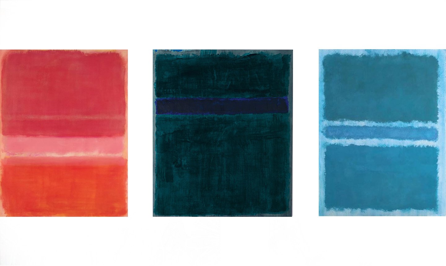
Mark Rothko: Untitled (Red), (L), Mark Rothko: Green, Blue, Green (C), Mark Rothko: Untitled (Blue Divided by Blue) (R)

Look, the couch!
1:Go opposite of pattern: It’s undeniably a flat block colour It’s a yes.
2: Match to all other elements: This artwork is modern and fits well within the vibrant color palette, mainly featuring pinks that align with the couch in the interior. However, its minimal pattern and lack of detailing, aside from the two chunky bands in different shades of pink, make it seem overly dense and divergent from the overall aesthetic of the room. It’s a no.
Overall: Not a match
Because our eyes are directed to the areas in the room that share similarities with the artwork, our eyes in this case are directed solely to the couch area, lacking broader visual engagement around the room.

Look, the chair!…and the floor…and the wallpaper…and back to the wall
1:Go opposite of pattern: Just another flat block colour It’s a yes.
2: Match to all other elements: In this case, our artwork showcases a dark teal/blue that corresponds to the color of a particular chair. While it primarily matches the color of this chair, my focus is drawn to other blue hues in the room, such as the cushion on the couch and the textured dark blue spots on the carpet. Being in the same color family appears to be enough for the colors to feel harmonious.
However, the concentrated block of dark teal-blue is excessively dark and dense in comparison to the much lighter shades present throughout the room. This creates a disproportionate diversion of attention, acting like a visual black hole. It’s a no.
Overall: Not a match
In this instance, even though the artwork is monochromatic, it aligns more closely with the various tones present in the room compared to the previous example. Consequently, our gaze seamlessly travels throughout the entirety of the space.

Look, the floor!…and the cushions.
1:Go opposite of pattern: Yep, it’s another flat block colour It’s a yes.
2: Match to all other elements: The bright light blue in the artwork closely mirrors the exact shade of the flooring. Although it's a blue akin to many other elements in the interior, my attention doesn't shift to the other, darker, and more purplish blues. Instead, it is drawn towards other pastel bright colors, such as the yellow cushion and the light green quilt.
Despite being the most accurate color match thus far, this single-color artwork still commands my attention, overpowering the interior and engaging in competition with every other element in the room, thanks to its overwhelming unbroken block color density. It’s a no.
Overall: Not a match
Despite this single block color artwork now harmonizing with various tones in the room and avoiding the darkness of the previous example, it still feels overpowering. In this space, artworks with solid block colors alone seem to struggle to find a suitable balance with all the littler details in the interior.

Look, all around the room!
1:Go opposite of pattern: It’s 2 flat block colours side by side It’s a yes.
2: Match to all other elements: Here we have the pink and bright blue artworks side by side. Considering them as a single artwork, we're now picking up and matching to a wider range of colors throughout the room. Additionally, with a few more stripes, there's a subtle nod to pattern. It’s a yes, only just.
Overall: It’s a match
When artworks are positioned together, they are assessed as a unified piece, influencing the overall balance of elements in the entire room.
Finding the perfect match
With the last set of artworks I wanted to show you what happens when you don’t go opposite of the uniting element in the interior.
So with these next 2 pieces, I’m going to show you what it looks like when you get that delicate balance right.

David Bromley: Nude Zippora with Butterflies (L), David Bromley: Zippora (R)

Perfect on paper, lost in the wallpaper
1:Go opposite of pattern: We encounter a graphic, albeit painted, portrait featuring washes of single-block colors and black stencil-like outline details. While there are some pattern-ish details with the repetition of flowers and butterflies, they don't quite form a distinct and recognizable pattern. It’s a yes?
2: Match to all other elements: For a portrait, it’s rather simple, stylized, and modern, matching the vibe of the rest of the room. The colors echo those found throughout the space, from blues and pastel teals to reds, with the skin tone closely matching the wood tones. The pattern-ish detailing, while not a distinct pattern, harmonizes with the pattern aspects present in the room.
It’s a yes?
Overall: Not a match
It's interesting to observe that all aspects of the artwork closely align with elements in the interior, creating visual interest while maintaining harmony with various aspects in the room. However, the only drawback is that, despite being theoretically perfect, this artwork still seems to blend into the wallpaper, doesn't it? The intensity of the block color just needs to be turned up a notch or two for a more impactful presence.

Blends in, yet stands out
1:Go opposite of pattern: Here’s a similar artwork, but with more solidity in the background that helps it stand out against the patterned wallpaper. It’s a yes.
2: Match to all other elements: Much like the previous artwork, this piece is graphic, modern, and incorporates colors that resonate with those found elsewhere in the room. The greeny-teals bridge the gap between the dark teals and the yellows and greens scattered throughout. The peachy background, while introducing a somewhat new color, still harmonizes with the various other pastels in the interior. In contrast to the last example, this artwork doesn't feature much in the way of a discernible pattern. It’s a yes.
Overall: It’s a match
Now, with solid colors complemented by smaller, contrasting details that steer clear of intricate patterns, things are clicking into place!
The incorporation of a new element into this interior—the imprecise, gestural painted outlines of the woman—injects a liberated and carefree energy into the otherwise meticulously groomed room.

Delicately balanced
1:Go opposite of pattern:
The first artwork is presented again, but this time with a dark teal frame featuring a white border around the artwork. The piece is now distinct from the background wallpaper, making a significant difference. The artwork no longer blends into the pattern of the background due to the small but impactful block color provided by the frame. It’s a yes.
2: Match to all other elements:
While we already know this artwork matches all the other elements in the room, the addition of the frame doesn't change this, as it also complements the overall aesthetic. What I want to emphasize is the contrast between this framed artwork and the previous peachy-color example, specifically regarding the interplay between pattern and block color.
The last artwork was a good match, but this one, with the frame, achieves perfection. With the pattern/block color separation flaw addressed, the artwork's increased similarity to the room becomes evident. It introduces more aligned colors, and the pattern details capture elements from the entire interior that the previous block color artwork didn't capture as effectively. This showcases what attaining an extremely delicate balance looks like! It’s a YES!
Overall: It’s a match
This is the epitome of a seamless match within the interior! It not only resonates visually with every element in the room but also brings its own unique contributions. Becoming the focal point with a human presence, it elevates the room's overall cohesion, creating an even more harmonious space, if such a thing is possible! It almost appears as though the entire interior design was inspired from this very work of art!
Let’s try a couple more
Now, let's see if we’ve got this. Artwork one features soft pastel block colors, while artwork two is predominantly solid dark blue. The question is, will the first one blend too much with the patterned background, and will the second one be too dark and dominant? What's your take?

Jean Michel Basquiat: Untitled, 1981 (L), Jean Michel Basquiat: Untitled (Pecho/Oreja) (R)

Scribbly pattern or blocky scribble?
1:Go opposite of pattern: We have an assortment of different pastel block colors forming the background in a sort of tortoiseshell pattern, with randomly placed large color swatches. It almost gives the impression of a pattern, but upon closer inspection, there's no apparent order to it. It’s a yes?
2: Match to all other elements: It's a modern, simple, and highly stylized piece that seamlessly aligns with the room's overall aesthetic. The colors harmonize with the broad spectrum of bright pastel tones present throughout the space, and the tortoiseshell-like arrangement of colors subtly nods to a pattern, integrating well with the surroundings.
It’s a yes.
Overall: Not a match
I feel like this artwork in theory should work in this space, however, there's a minor hiccup—it doesn't seem to pop off the wall adequately. Could the addition of a frame make it perfect this time?
A fortuitous fit
1:Go opposite of pattern: We have a sort of pattern, characterized by scribbly block shapes in various shades found throughout the interior, with some additional deep blue solidity around the edge provided by the frame. It’s a yes.
2: Match to all other elements: Now, with the frame, it truly pops off the wall. I'd say this works, but only just.
It doesn't fit quite as seamlessly as the last one (the lady with butterflies). This is because in the last example, there are more solid block pieces that contrast against all the patterns, while this one still appears somewhat patterned, although it has just enough solid blockiness to make it work. It’s a yes.
Overall: It’s a match
This one appears like a fortunate accident that could have easily gone the other way and not matched. Yet, with its multitude of colors resonating throughout the interior, this piece unexpectedly ties everything together. It injects a dash of unrestrained, impulsive, childlike rebellion into the room, countering the sweeter and more orderly elements that dominate the rest of the space.

Solid with fitting breaks
1:Go opposite of pattern: This artwork is unequivocally not a pattern. It predominantly features a solid dark blue block color. While it includes details, they consist of linework, lacking any repetitive or rhythmic patterns. It’s a yes.
2: Match to all other elements:
Once again, it's a modern, simple, stylized piece that aligns with the room's vibe. While lacking a distinct sense of pattern, it incorporates white detailing that breaks up the solid color, reminiscent of patterns in the room that also feature white details.
Various colors in small quantities reference the diverse palette of the interior. Touches of red, mid-blue, green, white, and light tan appear, with the majority of the artwork being dark blue (similar to the dark teal in the interior). The (dark) blue, serving as the main color in both the artwork and the interior, provides a sense of cohesion. It’s a yes.
Overall: It’s a match
The solidity of this artwork avoids overwhelming the interior, thanks to the playful, colorful 'fractures' that scatter across the deep blue canvas. While it seamlessly aligns with the whimsical and bright, almost childlike style of the room, this piece also introduces an interesting departure from the overall orderliness. The free, unstructured scribbly lines carry a childlike quality that fits with the broader childlike theme in a fresh and unrestrained manner.
Patterns that aren’t patterns
So, while we need to go opposite of pattern so the artwork doesn't get lost, we also need something that gives a subtle nod to pattern, making the artwork fit within all the other patterns. Confusing, eh? Now, let's explore a couple of pieces with pattern-like elements and see how they work in the space.

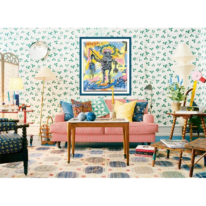
Kehinde Wiley: Portrait of Jorge Gitoo Wright (L), Kehinde Wiley: Portrait of Kea Loha Mahuta II (R)

Intricate detailing bordering on pattern
1:Go opposite of pattern: The background of this portrait gives off a strong pattern vibe. But, it's not your typical geometric pattern found in the room. Those recurring details, like the yellow flower heads, aren't following a strict, regular structure. Plus, it's built with solid block color shapes. And let's not forget the star of the show—it's a portrait, not just a pattern. Yet, interestingly, in the room, with all its intricate details, it still kind of blends into the chaos and is too patterny to stand out. It’s a no.
2: Match to all other elements: Here's a modern twist on a realistic portrait—it's bursting with vibrant colors and patterns, and did I mention patterns?
The main blue color in the artwork syncs seamlessly with the various blues scattered around the room. And check out that background pattern—it's like it borrowed a bit of flair from the floral cushion on the couch! It’s a yes.
Overall: Not a match
Almost there – this artwork complements various aspects of the room, but its placement on top of patterned wallpaper creates a bit of competition with the existing pattern. I can't help but think that if one of the other walls in this room were plain white (even though we can't see it from this angle), this artwork would be an ideal choice.

Flat low-contrast detailing does the trick
1:Go opposite of pattern: Here's another artwork, similar to the last but with a twist in the pattern department.
The background patterns here are larger, less intricate, and way less geometric. They have a flat, low-contrast, blocky quality that doesn't clash with the myriad of patterns in the room. It’s a yes.
2: Match to all other elements: This artwork has a color palette that interestingly mirrors but doesn't exactly replicate the colors in the interior. The shocking green falls in line with the mid-range shocking blue flooring. The bright purple aligns with the other mid-range brights like yellow, blue, green on the wallpaper, and the red on the couch. The red dress in the artwork, although red like the couch, is a slightly different shade.
In terms of patterns, this artwork holds its own, contributing to the overall pattern scheme in the room. It maintains a fairly modern feel, harmonizing well with the room's overall feel. It’s a yes.
Overall: It’s a match
Voila! Notice how it's a subtle pattern, yet simultaneously a flat block colour. Dark enough to stand out without overpowering the room by being too dark. Hunting down something so specific was no easy feat!

Larger details escape the pattern category
1:Go opposite of pattern: This is the first artwork, but it's cropped This serves a dual purpose: it enlarges the patterned pieces, creating a bolder visual impact, and, intriguingly, it removes the sense of pattern entirely, leaving only a few details that contribute to visual interest. It’s a yes.
2: Match to all other elements: Cropping this artwork doesn't alter its harmony with the interior. It maintains its modern, vibrant qualities, aligning with colors in the room. The retained fine details in the background maintain a subtle connection with the prevalent patterns in the space. It’s a yes.
Overall: It’s a match
With the pattern-like details now enlarged to resemble floral detailing, this artwork looks great in the interior. Let's take a moment to reflect on the subject matter. A realistic portrait might not be an obvious fit for this modern interior where precision in matching is key. However, with the modern background and a holistic assessment of the artwork, it demonstrates that even when precision is necessary in matching, it's always possible to find something that works seamlessly in any preferred style!
Incohesive Eclectic Interiors
Alright, think of it like having a cat in a wolves' den. In these incohesive interiors, you'll spot a bunch of things that don't usually hang out together. It's a wild mix of styles, vibes, colors, and patterns, and there's no grand plan holding it all together.
Picture it as if a magpie, on its adventures, gathers all sorts of interesting, bright, shiny things and just brings the whole collection home. Doesn't matter if it matches everything else, it's about the eclectic charm of each piece standing out.
How to make an artwork match in an Incohesive Eclectic interior:
When it comes to an Incohesive Eclectic interior, the "rules" for a great artwork match are surprisingly simple. Since not much in these interiors really seems to match, you don't need a perfect match with your artwork either.
Here's the secret: as long as your artwork syncs up with at least one notable element in the interior, you're good to go!
And trust me, with the crazy mix of elements in an Incohesive Eclectic space, you've got a buffet of artwork options. It's almost like it's harder not to find a match!
Some artwork that matches:
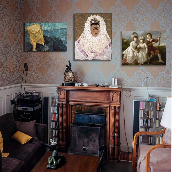
L: Van Gogh, Portrait of Dr Paul Gachet: From the yellow in the face matching the yellow in the cushions, to the muted jewel tones matching the deep jewel tones of the purple couch & the deep blue fireplace cover, the colours have matches. There’s also the representational imagery matching up to the modeling and crafting in the fireplace & wall detailing.
C: Frida Kahlo, Self-portrait as Tehuana (Diego On My Mind): The white & pink in the artwork matching the white and pink in the wall paneling & the chair cover. The flat representational portrait serving as a mid point between modern & traditional echoing the mix of traditional & modern elements within the room. The subtle flat pattern details in the painting matching the subtle flat patterns of the wallpaper & the sofa.
R: Angelika Kauffmann, Lady Georgiana Spencer, Henrietta Spencer and George Viscount Althorp: Here we’re leaning more into the traditional, matching up with the traditional feel of the ornate fireplace, lower wall paneling, and antique clock on the mantelpiece.

L: Hilma af Klint, Group X, No. 1, Altarpiece: We have the same artwork, but now with a large white mat board, and thin black frame, the piece is overall more graphic and 2d, and the epic impact and dynamism of the horse has been muted with the shift down in scale, and the enclosing box that the frame creates. The thin black frame now also aligns with the other thin straight black lines in the room. The overall associations of the image has also slightly shifted from epic-dynamic-war to grand-historical-memorabilia. The act of putting a frame around this moment almost shifts it into more of a documented specimen rather than something to be felt and experienced in the moment. Match.
C: Mark Rothko, Untitled (Yellow, Orange, Yellow, Light Orange): The artwork has now been made more airy and spacious with the large white mat board surrounding the artwork. Match.
R: Salvador Dali, The Disintegration of the Persistence of Memory: Light Mid. The addition of extra white has shifted the value of the overall piece in a lighter direction. Match.

Make it stand out
L: Tapestry (from India): We have the same artwork, but now with a large white mat board, and thin black frame, the piece is overall more graphic and 2d, and the epic impact and dynamism of the horse has been muted with the shift down in scale, and the enclosing box that the frame creates. The thin black frame now also aligns with the other thin straight black lines in the room. The overall associations of the image has also slightly shifted from epic-dynamic-war to grand-historical-memorabilia. The act of putting a frame around this moment almost shifts it into more of a documented specimen rather than something to be felt and experienced in the moment. Match.
C: Wassily Kandinsky, Swinging: The artwork has ow been made more airy and spacious with the large white mat board surrounding the artwork. Match.
R: Ansel Adams, Juniper Near Merced Lake Camp: Light Mid. The addition of extra white has shifted the value of the overall piece in a lighter direction. Match.
And some artwork that doesn’t match:

Make it stand out
L: Wyndham Lewis, Workshop: We have the same artwork, but now with a large white mat board, and thin black frame, the piece is overall more graphic and 2d, and the epic impact and dynamism of the horse has been muted with the shift down in scale, and the enclosing box that the frame creates. The thin black frame now also aligns with the other thin straight black lines in the room. The overall associations of the image has also slightly shifted from epic-dynamic-war to grand-historical-memorabilia. The act of putting a frame around this moment almost shifts it into more of a documented specimen rather than something to be felt and experienced in the moment. Match.
C: Hiroshi Yoshida, Kawaguchi Lake (Kawaguchi Ko), from the series Ten Views of Fuji (Fuji Jikkei): The artwork has ow been made more airy and spacious with the large white mat board surrounding the artwork. Match.
R: Lorna Napurrula Fencer Murkarki, Bush Plum via Japinkgka: Light Mid. The addition of extra white has shifted the value of the overall piece in a lighter direction. Match.

Make it stand out
L: Wassily Kandinsky, Maccia Nera: We have the same artwork, but now with a large white mat board, and thin black frame, the piece is overall more graphic and 2d, and the epic impact and dynamism of the horse has been muted with the shift down in scale, and the enclosing box that the frame creates. The thin black frame now also aligns with the other thin straight black lines in the room. The overall associations of the image has also slightly shifted from epic-dynamic-war to grand-historical-memorabilia. The act of putting a frame around this moment almost shifts it into more of a documented specimen rather than something to be felt and experienced in the moment. Match.
C: Franz Kline, Mahoning: The artwork has ow been made more airy and spacious with the large white mat board surrounding the artwork. Match.
R: Saul Bass, Such Good Friends: Light Mid. The addition of extra white has shifted the value of the overall piece in a lighter direction. Match.

Make it stand out
L: Sally Gabori, Thundi - Big River: We have the same artwork, but now with a large white mat board, and thin black frame, the piece is overall more graphic and 2d, and the epic impact and dynamism of the horse has been muted with the shift down in scale, and the enclosing box that the frame creates. The thin black frame now also aligns with the other thin straight black lines in the room. The overall associations of the image has also slightly shifted from epic-dynamic-war to grand-historical-memorabilia. The act of putting a frame around this moment almost shifts it into more of a documented specimen rather than something to be felt and experienced in the moment. Match.
C: Jean Michel Basquiat, Mitchell Crew: The artwork has ow been made more airy and spacious with the large white mat board surrounding the artwork. Match.
R: Wassily Kandinsky, Composition IX: Light Mid. The addition of extra white has shifted the value of the overall piece in a lighter direction. Match.